CultureCalling: Rainmaker Gallery

(An article I wrote for culturecalling.com) 

Discover: Rainmaker Gallery
23 December 2016 |
We take a look at one of Bristol’s unique attractions, Rainmaker Gallery – a gallery dedicated to the promotion of Native American art and culture.

Inside the gallery 
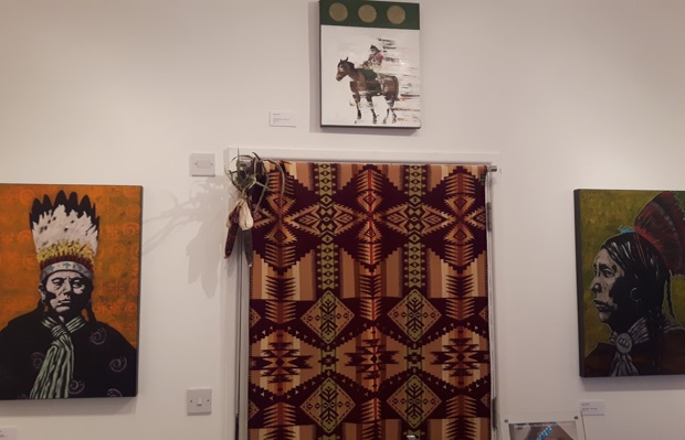
Rainmaker Gallery sells jewellery and art imported from contemporary Native American artists. Through talks and exhibitions, the gallery attempts to educate and encourage cultural awareness. From paintings to photographs, from Heishe beads to Pendelton Blankets, a wide range of pieces are on offer.
 
Founded by Joanne Prince twenty-five years ago, Rainmaker Gallery aims to challenge our preconceptions of Native American cultures. There are hundreds of distinct, unique cultures that are encompassed under the label “Native American” – a label that often falls victim to the same reductive stereotype. Prince started as an educator and was shocked at how often people misunderstood this distinction. She found it hard to breakdown these preconceptions, which had often been entrenched from childhood. Through art, however, Prince displays a fascinating alternative to the image of a basic, primitive people we are too often supplied.
 
As small as it is, Rainmaker provides a doorway from the bustling highstreets of North Bristol into another world. This is a place where rocks are transformed into animals that represent creation and life. This is a place where handmade dolls are infused with character and represent hundreds of unique deities. This is place where coral and shells become cherished jewels instilled with meaning.

Standing Bear- Fetish carving 

Despite these connections to ‘other worldliness’, however, Rainmaker is careful to remind the viewer that these people are 
contemporary artists, dealing with very real and very present issues. A recent exhibition, Still, displayed the work of Cara Romero, whose hugely powerful photographs show figures suspended in water. Prince has described her as ‘one of the most important Native artists today.’ Originating from the Chemehuevi Valley in the Mojave desert, Romero conveys the fragile and fundamental relationship her tribe have with their valuable water sources. In provocative pieces such as ‘Oil Boom’, she explores this and also hints at the industries that threaten these water supplies.
 
Cara Romero's Oil Boom
Other works are perhaps less challenging, but just as compelling. Nocona Burgess—a member of the Comanche Nation of Oklahoma and descendent of one of the most respected leaders, Chief Quanah Parker—seamlessly creates portraits that explore his cultural heritage and yet reference Pop Art. Other artists combine traditional mediums with art inspired by graffiti. These graphic works remind us how current Native American cultures are. Next year, a new exhibition will present Native American women in art, as an alternative to the out-dated, stereotypical views all too frequently advanced in main-stream media depictions, such as in Disney’s Pocahontas.
 
Heishi bead bracelet 

For lovers of culture, it is so powerful to be able to re-evaluate misconceptions through the medium of art. Bristolians are lucky to have this small outlet of such wide-ranging artworks. It is both important and a pleasure to experience the rich heritage of Native Americans and the beautiful, thought-provoking, political, complex art they continue to produce today.

Find out more about Rainmaker Gallery through their website.
0

Bernini's Cathedra Petri

Gianlorenzo Bernini’s Cathedra Petri is one of the most visually astonishing  and fascinating pieces to emerge from the Catholic Counter-Reformation. As a sculptor, Bernini was a ‘weapon in the armoury of the Catholic Church’ against its Protestant critics. In 1657, he was commissioned to enclose St Peter’s chair in a sculpture. What he created would exemplify the doctrines of Catholicism and Baroque art in general. 
Bernini's Cathedra Petri (1657-66), St Peter's Basillica 

Detail of the putti and tiara 

As a backlash to Protestant views of the Eucharist -which rejected the notion that The Gifts actually transubstantiated- the Counter-Reformation aimed to increase the significance of this ritual. The use of theatrical stage-like settings were an important change in the Catholic service, particularly in the case of the quarant’ore, or Devotion of the Forty Hours, where the Sacrament was left on the altar for forty hours. The service involved masses of candles in front of elaborate altars. It is in this context that Warwick has posed that the Cathedra was hugely significant, not only in responding to the Church’s needs but in fact changing the art used for this service. Prior to Bernini, elevated candelabra were used to symbolise a burst of light from the host.However, Bernini’s designs involved a system of two thousand hidden lamps which created a miraculous vision of the illuminated Eucharist floating.Additionally, in the Cathedra Petri, huge gilt sunrays shine through clouds, as if emanating from the Holy Spirit itself which is represented by the dove in the centre of the amber stained glass window. So, even without using any candles, there is the sense of divine light The window is also a powerful tool, because rather than using a painted backdrop, this utilises natural light sent from the sky by God. Thus, Bernini’s Cathedra was the perfect backdrop for a magnificent service which became central in the Catholic Church in the aftermath of the Reformation.
Detail of the sun rays 
Services in the Catholic Churches were multi-sensory performances which combined music and incense. The art created for this aimed to create strong, illusionary visual effects in order to elicit an awed, contemplative response. Bernini’s multi-media Cathedra Petri exemplifies the Catholic Baroque style. The stucco clouds impede onto the viewer’s space, floating ‘into’ the Church interior. The pilasters act as the ‘picture frame’ from which these elements appear to escape. Standing in front of the Cathedra, it seems as if these figures are coming through the window into our world, ‘transgressing’ the boundaries of space.Bernini’s Cathedra instilled a sense of wonder as well as acting as a didactic tool for the experiences Catholicism wanted to convey.
Detail of the window and the dove
 Surprisingly, the majority of historians explored in this essay have not gone into detail about the colours selected for both the Cathedra and the Baldacchino. The structures and their materials are analysed in depth but I would suggest the colours Bernini chose are just as relevant and telling. In contrast with the white marble pilasters, Bernini’s golden stucco sun rays and clouds are hugely powerful. No white is used in the Cathedra, juxtaposing with the rest of the Basilica. It is as if the entire structure is taken from a different space entirely, which promotes the idea that the laity has found a gateway into Heaven. In the cavernous white, light space that is the Basilica, the Baldacchino stands out with its dark, bold bronze. Linking with the Cathedra’s same colour scheme, they create a space with each other. It is in this way that Bernini excels in ‘bel composto,’ utilising entire compositions and colours with his two structures. Furthermore, I would draw attention to the way the gold is used to highlight the mitres of the four fathers. Whilst their bodies are dark and ‘earthly’, their mitres (and thus the symbols of their Saintly authority) are of the same colour as the other divine elements of the Cathedra: the clouds, Putti and sun rays. Here, Bernini was showing that the Holy Spirit had granted these Saints the divine right to act as intermediaries with the laity.
Detail of St Augustine's mitre 
Protestantism had questioned the legitimacy of Papal power, and with the Counter-Reformation, Catholic art aimed to reassert the supremacy of the Popes. The throne was a hugely important symbol of the succession of Roman bishops from Peter to the present. Hibbard has stated that ‘nothing symbolizes the new Ecclesia Triumphans [triumph of the Church] more clearly than Bernini’s Cathedra.  Supporting the structure are the four fathers of the Church: Saint Ambrose, Saint Augustine, Saint Athanasius and saint John Chrysostom. Rendered twice-life size, these hugely dominating figures represent the sanctity of the Cult of Saints and their continuity with present-day bishops. Furthermore, a tiara- the highest symbol of Papal authority- is held aloft by two winged putti. With their other hands they hold keys (attributes of Saint Peter), thus symbolising the connection between the great Saint and the Papal Church. Vernon Minor has stated a fundamental role of Baroque artists working under Catholic patronage was to promote ‘right thinking’ which encouraged the view that Catholic leadership was ‘natural and inevitable.’ I would argue this could not be more clearly exemplified than with Bernini’s seamless representation of St Peter’s relics and attributes alongside symbols of the Papal Church.
Baldacchino in the Basillica 


It is clear that every element of the Cathedra –the symbolism, composition and colour- contributed to be a powerful tool in the Counter-Reformation period. Many in the 1600s would not see imagery such as this on a daily basis and it would have contrasted starkly with Protestant churches.  Interestingly, the historiography surrounding the Cathedra discusses it as an example of Baroque architecture, sculpture, altarpiece, and a theatrical setting. Thus, it is clear how Bernini’s multi-media work transcends artistic description and accomplished its goal of creating an all-encompassing spiritual and didactic experience.


Based on an essay in which I got a first!


Bibliography

Blunt. A, Roman Baroque, (London: Pallas Athene, 2001) 

Boucher. B, Italian Baroque Sculpture, (London: Thames and Hudson, 1998) 

Emberson. I. A,  ‘Comparison between Orthodoxy, Protestantism & Roman Catholicism.’ http://christianityinview.com/comparison.html [accessed 12th November 2016]

Giorgi. R, The History of the Church in Art, (Los Angeles, The J. Paul Getty Museum, 2008) 

Hibbard. H, Bernini, (London: Penguin, 1990) p210-220

Kirkendale. W, Emilio de’ Cavalieri ‘Gentiluomo Romano’: His Life and letters, is roel as Superintendent of all the Arts at the Medici Court, and his Musical Composition, (Florence: L.S. Olschki, 2001) 

Little. S, …isms, Understanding Art (London: Bloomsbury, 2004) 

Lulofs. H, ‘A Design by Grimaldi for the Forty Hours Devotion.’ Master Drawings 30, no.3 (Master Drawings Association: 1992) 

Minor. V, Baroque and Rococo Art & Culture, (New Jersey: Prentice-Hall, Inc., 1999) 

Mormando. F, Bernini: His Life and His Rome, (Chicago: University of Chicago Press, 2011) 

Panofksy. E, ‘What is Baroque?’ in S. M. Dixon (ed.), Italian Baroque Art (Oxford: Oxford University Press, 2008)

Snodin. M, Llewellyn. N, Baroque: Performance, Pomp and Power: Style in the Age of Magnificence 1620-1800, (London: The Victoria and Albert Museum, 2009)

Tronzo. W, St. Peter’s in the Vatican, (Cambridge: Cambridge University Press, 2005)

Warwick. G, Bernini: Art as Theatre, (New Haven: Yale University Press, 2012) 


1

Throwback: Humans at the Hayward

Throwback to the Hayward's Exhibition 'the human factor' in july 2014... 

Despite wanting to stay home and eat ice cream all day, my mum managed to drag me to the Hayward Gallery for their new exhibition: The Human Factor. 
Me at the Human Factor 
I was reluctant at first, due to the fact that I do not normally relate well to sculptures that do not resemble what they claim to be. I guess I think art is more powerful when it really looks like its subject... but then again, for that I could just go to Madame Tussauds. Another reason that ice cream seemed more tempting was the fact that the exhibition promised to be both “unsettling” and “thought-provoking”.  Seeing as one of the most publicised images from the exhibition is a policeman and a large bear, I was not convinced.
So, with a very critical eye, -and part of my mind on my Ben & Jerry’s at home-, I entered the gallery. Although the first room did not really capture my interest, I was intrigued by the second collection of pieces. There was a large cut-out of Lee Harvey Oswald –the man charged with the murder of President Kennedy- who was shot to death by Jack Ruby, in front of the world’s press and eyes. The large cut out is Oozewald (1989) by Cady Noland. Although Oswald was in fact only shot once, Noland punctured eight large holes in the metal image. The explanation given by the Hayward Gallery, is that the holes also depict how the cameras were shooting through him too, and every public eye with them. To finish off the spectacle, Noland gagged her subject with an American flag. So, this is the first piece that captured my attention, not only due to its interesting appearance, but also due to the explanation behind it.

Oozewald (1989), Cady Noland

Relating to this topic is the life-like sculpture by Maurizio Cattelan, which he entitled ‘Now’. This displays the corpse of John F Kennedy, laid out in his coffin. This would clearly give many Americans the farewell that they needed. Amongst some grotesquely disfigured sculptures, I enjoyed observing Cattelan’s work, which looked so much like the former President, but with such a peaceful look on his face. My favourite thing about this, however, was (again) not the piece, but the information given with it. The Hayward states that JFK has bare feet in the piece, as Cattelan simply did not feel people should wear shoes or socks when they are sleeping. It is an interesting sentiment, which I think captures the entire piece: Cattelan has put JFK to a calm sleep, giving him the goodbye that the President never received. I also like this idea that not every part of an artwork has to make sense to the beholder, as long as it seems right to the artist. 

Now, (2004) Maurizio Cattelan 
 Another work of Cattelan’s also stuck in my mind. It is in fact the piece that finally convinced me this exhibition could truly be “unsettling” and “thought provoking”. Walking into a small room in the gallery, I instantly felt apprehensive. I am claustrophobic and I suddenly found myself in an empty room, alone if not for a small boy kneeling on the floor. It took me a few seconds to realise the boy was a sculpture, but I was still nervous somehow. Something about the boy’s clothes made me instantly think ‘Holocaust’, and –as a Jew myself- a fierce desire to protect him crept in with my general feeling of anxiousness. I was sure that I would find a crying boy, with a huge yellow star on his lapel, and some kind of horrible back-story. Starting forwards a few more paces, I slowly began to make out the shape and detail of the head. And then... could it be... is it... It is. This is no kneeling boy. This is Adolf Hitler. There is a plaque on the wall, with some kind of explanation, but I don’t think Cattelan’s ‘Him’ needs any explanation. It is simply powerful, and yes: “unsettling” and “thought provoking”.

Him, (2001), Maurizio Cattelan

 Moving on to a very different kind of sculpture, this is ‘Monika and Pawel’, by Pawel Althamer. This depicts the artist and his first wife, fully immersed in operating their electrical gadgets. Their bodies are made with animal intestines and straw, which is instantly both repulsive and incredibly intriguing. Of course, over time this couple will slowly decay, and their gadgets –which they were so involved with- have already stopped working. I think this is such an interesting concept, and so very brave of Althamer to have done it using Monika and himself as the subjects. I don’t think I could stand to see my own work degrade and crumble away, let alone one that resembles me. I am glad that Althamer could though, as this is such a powerful comment on life, and modern obsessions with technology.

Monika and Pawel, (2002), Pawel Althamer. 

 However, not every piece in the Hayward gallery appealed to me as much as the ones I have mentioned. This is always going to happen in every exhibition, but these next two pieces went as far as to really frustrate me: they are so close to being amazing pieces, but in my eyes there are fundamental problems with them. Throughout the gallery, there are signs warning us that there are live bees in one of the pieces. I was intrigued and excited to discover how they would be incorporated into an artwork. In my mind’s eye, I was seeing huge installations covered with bees, paired with an interesting explanation. So, I was in fact disappointed walking out onto a balcony to be met with Pierre Huyghe’s Untitled. It is simply a reclining woman with a beehive on her head. Creative, yes, but creative enough?... well, no. Perhaps the main problem was the anticlimax of being warned about the bees throughout the visit, only to see a very small beehive with no real significance.

Untitled, (2012) Pierre Huyghe

 My second bone that needs picking, is with Paul McCarthy’s Life Cast displaying a naked woman in three different positions. I was immediately angered by the sight of these sculptures. The female subject is beautiful, petite, and completely hairless below her eyelashes. I found myself wondering about the point of this sculpture. There is nothing unusual about seeing this depiction of women. To see this kind of woman, anyone can open up a men’s magazine, and I would not call that art. The thing is that the technique used on these figures is amazing at creating such resemblance to living people. McCarthy has taken care to include the veins on the woman’s legs, which instantly adds another element of life. So, clearly, McCarthy is interested in detail, but there is little else to add to this woman: she has smooth skin all over her entire body. I was instantly thinking how much more powerful the pieces would have been if they were middle-aged, larger women, with imperfections that are completely normal, much like McCarthy’s ‘Dreaming’, which is a cast of himself. This piece- which was not part of The Human Factor- displays a middle aged man, covered in hair. He does not have a perfect body, and that just makes the artwork that much more interesting. So, perhaps I am angry that the Hayward picked three naked women over a far more intriguing piece.

Dreaming, (2008-12) Paul McCarthy, 

That Girl, (2008-12) Paul McCarthy

 So, moving back to artworks that did not miss the mark: I keep thinking about Ryan Gander’s little bronze pieces. With insanely long names, these tiny ballerinas have abandoned their plinths elsewhere in the gallery, to live their own lives. One presses her face to a window, and the other hides behind her stand to have a cigarette break. As there was no rope around the piece, I could stand really close to the ballerina whose face was against the window. I love the curiosity, youth and freedom displayed there. Even though the girl is just as stationary as the other sculptures, it made me think of movement and living life. The ballerina taking a drag from a cigarette has less youth in her appearance, and more tiredness. She has spent her life being stared at, and just wishes to have some privacy. I almost felt guilty for finding her hiding place behind her plinth. These pieces made me think about another element of galleries, and sculptures, which is a very powerful thing for me.

I Don't Blame You, (2008) Ryan Gander 
 A third Gander piece also portrayed innocence, youth and freedom.  He modelled ‘Tell My Mother Not To Worry’ on his child pretending to be a ghost, using a bed sheet. It does not really need any more explanation than that, but I found myself observing it for longer than I thought I would. The movement created in the ‘sheet’ really does make you feel you can lift it up and find a laughing toddler underneath.
Tell My Mother Not to Worry, (2012) Ryan Gander 

 The final artist that also made me think about another element to sculptures was Martin Honert, who creates sculptures that resemble photographs. When I initially saw ‘Hamburger Bahnhof’, I began to walk away. It had a weird appearance, that I didn’t like at first. It was not until my audio guide mentioned it had been based on a photograph that it all made sense. That was the ‘weird’ thing about the model. It really does look like it has walked out of an old photograph. Honert painstakingly recreated the dappled effect people have in old photos, and the different colours caused by light intensities. This first one is based on Honert’s old school teacher, whilst the second is of Honert as a child. When I took off my glasses, I could almost believe these sculptures were 2D. They are a really interesting and creative way of manipulating photographs and sculptures,  that I had never thought of before, and I would love to see more of his work.
Hamburger Bahnhof, Martin Honert 

Hamburger Bahnhof, Martin Honert 
So, these few pieces surprised me, being both “thought-provoking” and “unsettling”. Definitely worth giving up an ice cream for!

copyright © . all rights reserved. designed by Color and Code

grid layout coding by helpblogger.com